Introduction to Microsoft Office
Important: Please note that you must register on the EG1003 website before performing the lab.
Objective
The objective of this lab is to use Microsoft Excel to analyze two case studies. The first case study will evaluate the acceleration due to gravity of a free-falling body and the second case study will analyze the historical trends for energy consumption in the United States.
Overview
This lab is designed to teach proficiency with Microsoft Excel. This application is widely used in academia and the public and private sectors so proficiency in this application is a requirement. Completing assignments in EG1003 requires a basic competency in Microsoft Office and the following exercises are designed to create that competency.
Microsoft Office
Microsoft Office is a software suite that bundles Microsoft Excel, PowerPoint, Word, and additional programs and apps.
Microsoft Excel is a spreadsheet program. Its function is collecting, processing, and analyzing data. Microsoft Excel has many features that streamline data analysis. It can be used to generate tables and graphs. It is useful for showing the relationships between data sets and identifying trends. Graphs will be required for many lab reports and presentations.
Microsoft PowerPoint is a presentation application. Its function is to create slides for presentations. In this course, eight lab presentations, three Milestone presentations for the semester-long design project, and a final sales presentation for the semester-long design project will be created and presented using PowerPoint.
Microsoft Word is a word processing application. Its function is writing and editing text. In this course, Microsoft Word will be used to write nine lab reports.
Saving Work
The information on the lab PCs cannot be accessed outside of the lab rooms. Email copies of all the files created on the lab PCs to a personal account.
Materials and Equipment
- A lab PC
- Microsoft Office suite
Procedure
1. Case Study: Free-fall
In this exercise, common Excel equations and tools will be explored through the context of a problem.
A ball is dropped from the roof of the Bern Dibner Library building and the distance between the ball and the ground is measured and recorded as a function of time with a Lidar scanner. The time and distance data are shown in Table 1. The velocity in meters per second, average velocity in meters per second, and acceleration due to gravity in meters per second squared of the ball will be calculated using Excel.
| Time (s) | Distance (m) |
|---|---|
- Open the Microsoft Excel Template containing Table 1. The velocity of the ball is the change in distance over time. To calculate the instantaneous velocity at each point in time, a formula (1) is used.
(1)
- In (1),v is the instantaneous velocity, is the second distance point, is the first distance point, is the time corresponding to the second distance point, and is the time corresponding to the first distance point.
- Assuming the initial velocity is zero, enter 0 into cell C2. In cell C3, enter the formula =(B3 - B2)/(A3 - A2). The velocity will be negative because the ball is traveling downwards.
- Reselect cell C3. Click and drag from the bottom-right corner of the cell down to cell C12. This will copy the formula for the other cells in the column using the data in column A and column B (A3, A4, B3, B4 for cell C4, and so on).
- To calculate the average velocity of the ball across the 11 data points, select cell D2. Enter the formula =AVERAGE(C2:C12).
- Microsoft Excel is commonly used to visually represent data in graphs. Create a scatter plot for the relationship between velocity and time.
- On the Excel ribbon, click on the Insert tab, and click Scatter on the Scatter option under the Charts group. This should create a blank graph, as shown in Figure 1.
- File:Lab ScatterPlots Office.pngFigure 1: Inserting a Scatter Plot
- Right-click on the empty graph and select Select Data.
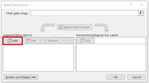
- Under the Legends Entries(Series) tab, click on the Add option, as shown in Figure 2. A new window called Edit Series will appear.
- In the Series X values textbox, delete the {1} and highlight cells A2 to A12. In the "Series Y" values textbox, delete the {1} and highlight cells C2 to C12. Click OK to generate the scatter plot.
- Add axis titles to the graph by clicking Axis Titles in the dropdown menu at the top right of the graph. Rename the axis and title.
- On the Excel ribbon, click on the Insert tab, and click Scatter on the Scatter option under the Charts group. This should create a blank graph, as shown in Figure 1.
- Acceleration is the rate of change of the velocity, or the slope of the velocity vs. time graph. For roughly linear data on Microsoft Excel, a line of best fit is used to approximate the relationship between the data points in (2).
(2)
- In the dropdown menu at the top right of the graph, hover over Trendline and click on the black arrow. Select More Options.
- Under the Format Trendline window, check off Display Equation on chart.
- Check the slope of the graph and compare it to the acceleration due to gravity in New York, -9.802 . Discuss and explain the discrepancy.
2. Case Study: Historical Energy Statistics
This exercise provides an overview of creating line graphs and pie charts in Excel to analyze the historical trends of renewable energy consumption in the United States.
The statistical data presented in this exercise is derived from the U.S. Energy Information Administration (EIA). Using the data, four graphs will be constructed: a line graph showing the yearly trend for hydroelectric power, geothermal power, solar power, wind power, and biomass power, and a pie chart representing the 2019 distribution in renewable energy. These graphs will be appended with data regarding fossil fuel energy consumption.
Modeling a Yearly Trend
- Download the Excel file containing the data for the yearly energy consumption of various renewable energy sources from 1949 to 2019.
- The line graph will contain multiple lines that represent the different renewable energy sources. The procedure to graph the renewable energy consumption for hydroelectric power is provided. Complete a similar procedure for the remaining renewable energy sources.
- On the Excel ribbon, click on the Insert tab, and click Scatter with Straight Line on the Scatter option under the Charts group. This should create a blank line graph, as shown in Figure 3.
- Right-click on the empty graph and choose the Select Data option. A new window will appear where the graphed data can be inputted.
- Under the Legends Entries (Series) tab, click on the “Add” option, as shown in Figure 4. A new window called Edit Series will appear.
- In the Series name textbox, type in the name of the power source, Hydroelectric Power.
- In the Series X values textbox, highlight the years in column A from 1949 to 2019.
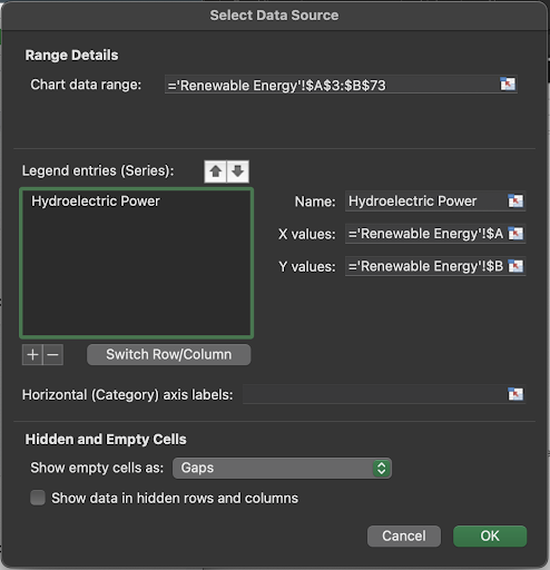
- In the Series Y values textbox, highlight the total energy consumption from hydroelectric power in column B that corresponds to 1949 to 2019. The Edit Series should appear similar to Figure 5.
- Click OK to graph the Hydroelectric Power data.
- Next the data for the remaining renewable energy sources must be added to the same graph. To add the data, repeat steps 2b to 2g for each renewable energy source.
- Rename the axes and titles for the energy source in the graph. Include a legend by checking off Legend in the dropdown menu at the top right of the graph.
Modeling the 2019 Distribution
- To visualize the distribution of the various renewable energy sources in recent years, a pie chart will be created based on the 2019 year. This part will continue with the raw data obtained from the previous part.
- On the Excel ribbon, click on the Insert tab, and click 2-D Pie on the Pie Chart option under the Charts group. This should create a blank line graph, as shown in Figure 6.
- Right-click on the empty graph and choose the Select Data option. A new window will appear where the graphed data can be inputted.
- Under the Legends Entries (Series) tab, click on the Add option. A new window called Edit Series will appear.
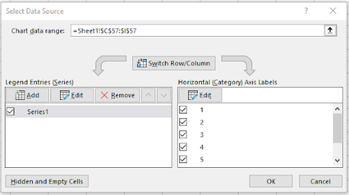
- In the Series Values textbox, highlight each renewable energy sources’ total energy consumption for 2019. Completing this will automatically create five labels under the Horizontal (Category) Axis Labels tab, as shown in Figure 7.
- Select the row labeled 1 and click on the Edit option under Horizontal (Category) Axis Labels tab. In the Axis-label range textbox, select the names of each renewable energy source (B2:F2) type in Hydroelectric Power and select OK. Repeat this step with the following rows with their corresponding energy sources.
- Rename the title for the energy source shown in the graph.
Fossil Fuel Energy Modeling
- Copy the data in the Fossil Fuel data sheet (located at the bottom left of the Excel spreadsheet) to the main data sheet. Ensure that the data on the main sheet is not overwritten by the Fossil Fuel data.
- Following the same steps as the Modeling a Yearly Trend procedure and Modeling a 2019 Distribution, create a new scatter plot and a new pie chart representing both renewable energy sources and fossil fuel energy sources.
- The renewable energy sources scatter plot should have five series: Hydroelectric, Geothermal, Solar, Wind, & Biomass.
- The fossil fuel energy sources should have three series: Coal, Natural Gas, & Petroleum.
- There should be eight series.
At the end of this case study there should be four graphs:
- A scatter plot displaying the renewable energy sources
- A pie chart showing the 2019 distribution in renewable energy
- A scatter plot displaying both renewable energy sources and fossil fuel energy sources
- A pie chart showing the 2019 distribution in renewable energy sources and fossil fuel energy sources
Assignment
The Excel files must be zipped in a folder and submitted to the EG1003 website by 11:59 PM the night before your next lab. There is no individual lab report or team presentation for this part of Lab 1.
| ||||||||

 is the second distance point,
  is the first distance point,
  is the time corresponding to the second distance point, and
  is the time corresponding to the first distance point.


 . Discuss and explain the discrepancy.


