Microsoft Office Skill Builder
Important: Please note that you must register on the EG Website before performing the lab.
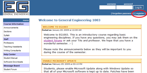
- Click on the register link as shown in Figure 1.
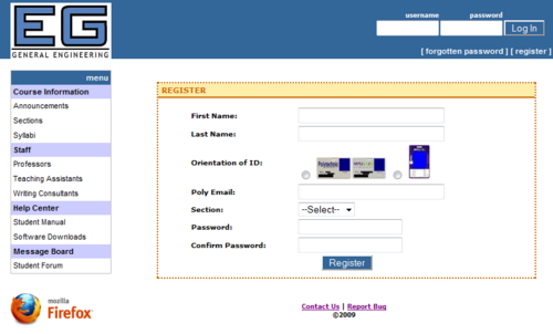
- Fill in the appropriate information on the form shown in Figure 2 and submit it.
- Note: Please make sure that you capitalize the first letter of your first and last name.
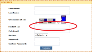
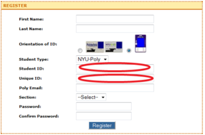
- Select the type of ID card you possess. Based on the type of ID you have, you may be asked for different information. If a Unique ID is asked of you, it is the barcode on the back of your ID.
- Fill in the remaining information accordingly.
- Note: If your email is flast99@students.poly.edu or flast99@nyu.edu, then flast99 will be your username.
- IMPORTANT!!: After you are registered, a TA must approve your account before you can log in.
Objectives
The objective of this lab is to use Microsoft Word, Excel, and PowerPoint to perform specific exercises and become accustomed with the tasks that each application is best suited for. Your goal is to complete the assigned tasks and obtain a basic familiarity with these three applications.
Overview
This lab is designed to introduce you to three Microsoft (MS) applications: Word, Excel and PowerPoint. These programs are widely used throughout academia and business so many of you may already have some familiarity with them. Completing your assignments in EG1003 will require a basic competency in them; the following exercises are designed to ensure you have this competency so please complete them.
With the recent release of MS Office 2010, EG1003 is in a transition period between MS Office 2007 and MS Office 2010. Either version of MS Office may be used to complete this lab. At this time, it is believed that there are no differences, other than cosmetic ones, which will impact how this lab is performed.
Microsoft Word
MS Word is a word processing program; its function is to help you create and edit text. It has features that make the mechanics of technical writing relatively easy, but it also has features that make academic dishonesty and plagiarism very easy as well. You are expected to do all the exercises and assignments for this (and all other course assignments) yourself, unless you are specifically told otherwise, e.g., when you do a team report.
When Microsoft released MS Office 2007, they introduced a new user interface to the MS Office Suite. When MS Word is launched, you will this new Ribbon interface at the top of the screen. The Ribbon has several features. In the top-left corner of the windows is the Office Button, where functions that manage the document are found. MS Office 2010 replaced the button with the File tab. These functions include actions like opening, saving, and printing a document. Next to the Office Button, or above the Ribbon in MS Office 2010, is the Quick Access Toolbar where frequently used functions can be found. Initially, there are only three icons, corresponding to saving the document, an undo of what you just did because you changed your mind, and an icon that will have Word repeat what you just did. You can add more items to the Quick Access Toolbar if you want, but we won't be doing this in this lab. Below the Quick Access Toolbar is the Ribbon, where the tools you'll use for the document are located. At the top of the ribbon are a set of tabs, which operate like the tabs on physical folders in a file cabinet. Looking at the tabs, you can see the functions available. For example, right now you're on the Home tab. The area below the tab is organized into several collections which are named at the bottom of the ribbon. Collections are used to logically break down and group similar functions together. Most people will see Clipboard, Font, Paragraph, Styles, and Editing collections on the Home tab.
You can create tables and write equations in MS Word. It also has spelling and grammar checkers and a thesaurus to help you eliminate mistakes in your writing. But beware: running spelling and grammar checks does not eliminate the need for careful editing of all your documents. As powerful as these tools are, they are not foolproof.
In this course, you will use MS Word to write lab reports. The thesaurus allows you to quickly find synonyms, so that you can avoid boring repetition in your writing. To use the thesaurus, put the cursor anywhere within the word for which you would like to find a synonym. On the Ribbon, select the Review tab. Then, in the Proofing collection, click on the Thesaurus icon, which looks like an open book. The equivalent words (synonyms) will be shown on the right side of the screen. Just double-click on the one you want to use.
Microsoft Excel
Data collection, manipulation, and analysis are critical steps in the research and design phases of any project. Data can come from a variety of sources including experiments and design calculations. MS Excel, a spreadsheet program, allows you to compile and analyze your data in a systematic fashion.
MS Excel has many features that streamline data analysis. You can use it to generate tables, charts, and graphs. Excel includes formatting tools, editing features, built-in functions, data manipulation capabilities, and graphing features. It is especially useful for uncovering the relationships that exist between data and to identify trends. You will use it to create graphical elements that will be embedded in your reports and presentations.
Microsoft PowerPoint
MS PowerPoint is a presentation program; its function is to create slides for presentations. Presenting information has always been intrinsic to engineering projects. Product introductions, requests for funding, progress reports, and reports to management are just some examples of occasions where presentation skills are required by technical professionals.
Remember, MS PowerPoint is a tool that will help you make better presentations. It is not a substitute for the longstanding rules to which good public speakers have always adhered. It is most effective when you use it to illustrate the points you want your audience to understand. In EG1003, you will use MS PowerPoint to report on your lab work and to present your progress on your semester-long design project.
These software tools are essential to your success in EG1003 and beyond. This lab is designed to help you master them by having you perform a specific set of tasks.
Your Assignment
Individual Lab Report
There is no formal write-up for this lab. Instead, you will submit:
- A title page
- Your MS Word exercises (generic and personalized schedule)
- Note: The title page and Microsoft Word exercises should be in a single MS Word document, with the title page and each exercise separated by page breaks. To make a page break, put the cursor where you want a page break, select the Insert tab on the Ribbon, and then click on the Page Break icon in the Pages collection.
- Your MS Excel exercise (table and graph). Submit the MS Excel file, which has an .xlsx file extension, separately, not as part of the MS Word document.
IMPORTANT! Submit your report electronically using the EG website. You will need to login and upload the lab report material. Submission instructions, a sample coversheet, and a syllabus showing the deadlines for your section are located on the website.
Materials and Equipment
- Lab PC
- Microsoft Office Suite
Remember: You are required to take notes in lab. Experimental details are easily forgotten unless written down. You should keep a laboratory notebook for this purpose. Each week, at the end of lab, you must hand in a copy of your lab notes for the TA to scan and upload to the EG website. You will need to include the lab notes at the end of your lab report. Keeping careful notes is an essential component of all engineering and scientific practice.
However, for this lab only, you are not required to take lab notes, or submit them.
Procedure
Microsoft Word
Most software has a built-in reference manual to help you learn the program. For all, current MS Office products, the help icon is a white question mark in a blue button located at the top right corner of the window. Use it whenever you are in doubt about how to do something. This, and regularly saving your work, will save you many lost hours over your working lifetime.
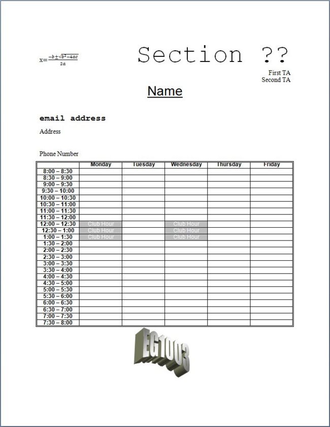
You are going to create two MS Word documents. One will look like Figure 5.
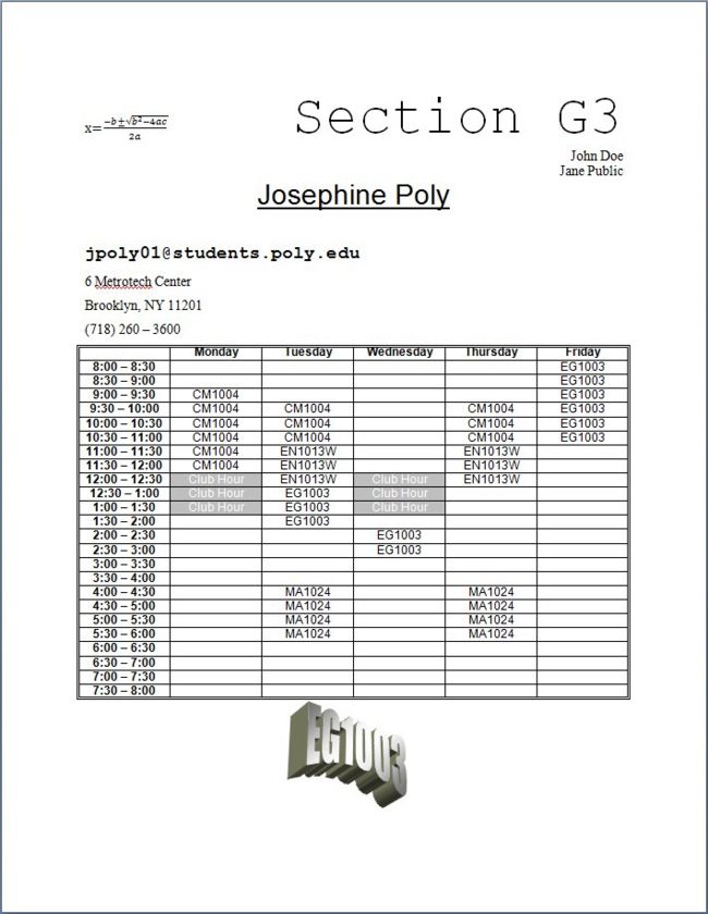
The other will be personalized, and will look like Figure 6.
- Launch Microsoft Word. To do this, click on the Windows icon in the bottom-left corner of the screen, which opens the Start Menu. Click on the All Programs item that appears just above the button. This will show you all the software on your computer. On the list that appears, click on the Microsoft Office menu item. This will expand to show the MS Office components. Click the Microsoft Office Word 2007 or Microsoft Office Word 2010 menu item.
- Enable the ruler. So far all we see is a blank sheet of paper. Some of our work will require that we know where things are located on this sheet. To help us, click on the View tab. This will change the ribbon to what's shown in Figure 7. In the Show/Hide collection, there's a box next to the word Ruler. By clicking on this box, we'll display rulers on the top and side of the electronic sheet of paper, allowing us to align text and objects. This will be very helpful later.
- Change the font face and size. Click on the Home tab and locate the Font collection. To understand this section of the ribbon, we need to discuss typography. A typed letter printed on a page or displayed on a screen has a number of attributes. The first is its font face, or font for short, which is how the letter looks. Fonts come in two different types. The first is a serif font, meaning that its letters have small tails and curves that make it look good. However, these letters tend to be thin to leave room for the extra frills. The alternative kind is a sans serif font because the letters do not have this level of detail. MS Word has many fonts of both types to choose from. The second attribute a letter has is its size, specified in points, corresponding to the height of the letter. A point is 1/72 of an inch, so a 12 point letter will be 1/6 of an inch high. Figure 5 shows the Font collection. Notice how all the terms described are shown, plus more. The default font is Calibri 11 points, which is very readable, but not formal enough for a report, and also a little on the small side. Therefore, we'll change it. On the top-left side of Font collection, you'll see the font name of Calibri (Body) and next to it the font size of 11 points. Next to the font name you'll see a small arrow pointing downwards, indicating that there's a pull-down menu of fonts to choose from. Click on the arrow, find the Times New Roman font, and click on it. The fonts are in alphabetical order, and also show what they look like. Notice that the font name is now changed. Next, click on the downward facing arrow next to the size, showing a menu of type sizes. Choose 12 for 12-point font. Times New Roman is the font many newspapers use because it is very readable, and looks good as well.
- Add style to what you type. Finally, we can change how the letters look to add emphasis. We can make them bolded, italicized, or underlined. For example, the first time words are defined in this lab, we make them bold and italics. You can give letters these special attributes by clicking on the buttons in the Fonts collection shown in Figure 9.
- Align your text. We can choose how words fill the line on paper. The default is Left alignment which means the words start on the left side of the line and continue right until there is no more room and any text that follows is pushed to the left side of the next line. This is the way we write, where all the text is lined up on the left side of the page. There are other choices. We also have Centered alignment, where the text is centered on the line and if new text is smaller than the line what the line can hold, the existing text will shift left and right to accommodate the new text. There is also Right alignment, where the text is lined up against the right margin, and there is space on the left side. Finally, there is Justified and Distributed alignment. These two types of alignment make text appear as if text were both lined up on the left and right sides. With Justified alignment, space is added between words to make this possible. With Distributed alignment, space is added between characters. It is a good idea to use the Times New Roman 12-point font, with Justified alignment as your default, i.e., your starting font and format. This will give your reports a professional look. Paragraph adjustments are located in the Paragraph collection shown in Figure 10. In the bottom-left corner of this collection you'll see the justification choices shown in Figure 11. For this lab, we're not producing a formal report, so we'll use left alignment instead. Click on the leftmost icon in the among the alignment buttons (the one that looks like text is lined up on the left side) to do this. Also, note that if you hold the cursor over any icon, a small message, called a tool tip, will pop up telling you what the icon does.
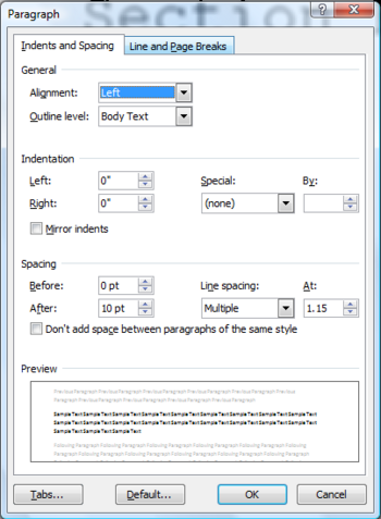
- Set a right-aligned tab at the right margin (6.5 inches). Sometimes we'd like to leave blank space and just move to a specific place on the line, filling in blank space as needed. In typography, this is called a tab, and MS Word allows us to set tab stops at specific places. This is why showing rulers helps. For example, if we right align text, all the text will be right aligned, which might not be what we want. If we want text to be placed in a specific location, we create a tab stop. In the Paragraph collection, click on the small arrow in the bottom-right corner of the collection, next to the collection name. This brings up a dialog box that gives us more control over the paragraph. This dialog box is shown in Figure 12.
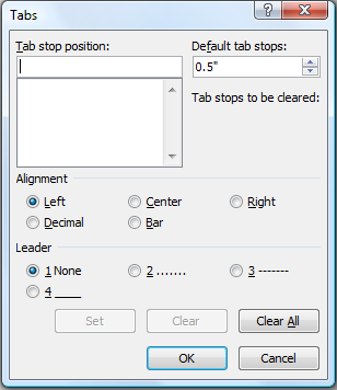
- Click on the Tabs... button in the bottom-left corner of the window, and a new window shown in Figure 13 will appear.
- You can set the alignment of tab stops, just as you can align text with the margins of the page. With tab stops, you can align text five ways. You can align tab stops to the left, center, and right just as with the margins of the page. There are two additional alignments you can choose from. One is the Decimal alignment, where text at that tab stop position is aligned to a decimal point in a number. This is especially helpful when displaying data with decimal points without the use of a table. The last alignment doesn't actually align text: the Bar alignment inserts a vertical bar at the tab stop position. Again, this alignment may be useful to separate data without the use of a table.
- Leaders can also be set. Leaders are punctuation marks (none, decimals, dashes, underscores, or dots) that fill in the space between where the tab is started to the tab stop position.
- Where tab stops are placed is determined using the Ruler we previously activated. Tab stop positions are measured from the left margin of the paper. By default, the unit of measure is inches. To set a tab stop using the Tabs dialog box, select the type of alignment and type of leader you wish for the tab stop. Next, enter the position you wish to place your tab stop, measured in inches (by default) from the left margin of the paper, in the Tab stop position text box. When you are satisfied, click the Set button to create the tab stop. You can create as many tab stops as you wish. After all tab stops have been set, select OK to confirm all your selections.
- Space out your paragraphs. We can decide how much blank space we want to follow a paragraph. Once again, we'll open the paragraph control window by clicking on the small arrow in the bottom right corner of the Paragraph collection shown in Figure 10. This opens the dialog box shown in Figure 12. Under the Indents and Spacing tab, locate the Spacing options, where you can set how much blank space is before and after the paragraph. The current settings show zero points (nothing) before a paragraph and 10 points after it. This is a good choice for most work, but we want to change it for this lab. Therefore, double-click on the 10 in the After box, highlighting the number, and type 0 (zero), indicating that no blank space should follow the paragraph. Now click the OK button.
- Write the equation. Before we begin, check that the paragraphs we're going to create are initially set for left alignment. If the button that shows left alignment is not highlighted, click on it to select it. Now we're ready to start creating the page. First we'll make an equation.
- Focus on the workspace. The cursor should be blinking as a vertical line at the top-left corner of your page. If it's not blinking, click anywhere on the page to bring it into focus. The vertical bar shows where the equation will be placed.
- Click on the Insert tab. Figure 14 below shows what the ribbon looks like now. Note that the ribbon changes to things that can be inserted into the document. The groups are Pages, Tables, Illustrations, Links, Header & Footer, Text and Symbols. In the Symbols group you'll see the Equation icon. Click on the Equation icon. The arrow under the icon will show you the more common equations that Word already has stored. Unfortunately, they are rarely what we will want, so be careful to click on the icon and not the arrow under it. Two things happen. The ribbon changes to the Design tab on the menu to show things you can use to make an equation, and on the document an area appears that says Type equation here. Figure 15 shows what this looks like.
- To insert the desired quadratic equation in the upper left-hand corner of the page, proceed as follows:
- On the left side of the ribbon, you can select the kind of text you want. Select Normal Text from the list.
- Begin by typing "x=" (as usual, without the quotes).
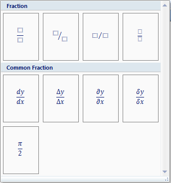
- On the right side of the ribbon, you'll see the Structures group. Click on the Fraction icon. This will bring up the Fraction palette shown in Figure 16:
- Select the style of fraction you want by clicking on it. In this case we want the regular vertical fraction, which is the first one shown. Note that the fraction now appears in your document, with two empty boxes. You click on each box to fill in the top and bottom of the fraction. We'll start with the numerator (the top box), so click on it.
- Type "-b" and then select the plus-or-minus symbol from the Symbols group (this is called a gallery by Microsoft) on the ribbon. The symbol you want is the very first one shown.
- Click on the Radical icon from the Structures group. Select the square root item from the palette, and click the box inside the radical on the document so we can fill it in.
- To superscript text (necessary for the "2" in "b2"), click on the Script icon. We want the first selection, which is a simple superscript. The item appears in the equation. Click on the the larger box and put in the letter "b" term being squared. Next, click on the little box for the power and put a "2" in it. Next, press the right arrow to move the cursor right behind the b2 term, and fill in the rest of the numerator.
- Click on the bottom box to fill in the denominator, and type in the "2a" term. When you are finished, click outside the equation box to return to the ordinary word processing mode.
- Type the text in quotes below, without including the quotes or the italicized attributes:
- Now, type the text paragraphs and give them the following attributes:
- for all text that is aligned right, use single spacing
- for all text that is centered, use double spacing
- for all text that is aligned left, use 1.5-line spacing.
- It is a good idea to periodically save your work. To do this, click on the Office button. Click on the Microsoft Office Button, then click on the Save menu item. Name the file "lab01generic" and save it in your account's Documents folder.
- Next, you will insert a table.
- Position the cursor by putting your mouse directly below the "Phone Number" line and clicking it. A vertical bar (the cursor) will appear at the left end of the line.
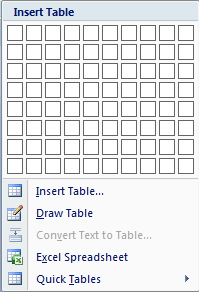
- Click on the Insert tab to get back the ribbon shown in Figure 14. Click on the Table icon. The gallery shown in Figure 17 will appear.
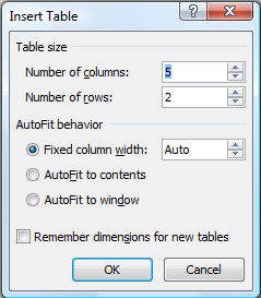
- You can create small tables by using your mouse to select the desired number of boxes off of the grid. However, our table will be bigger than the grid provides. Therefore, click on the "Insert Table..." item at the bottom of the gallery. This will bring up a window that allows us to build a custom table. It's shown in Figure 18.
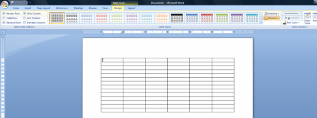
- For your Word document, select 6 columns and 25 rows, and click OK. This will create your table and move you to the design ribbon for the table, as shown in Figure 19:
- Now we need to fill in the cells in the table. Click on the Home tab so we can create and edit our text. You can give each cell font attributes or fill it in with text by clicking inside the cell with the mouse. You can also give multiple cells the same attributes by dragging the mouse over them. Make all the cells Arial, 10 points, center justification for the text in the table. For the first row and the first column, make these cells bold text. If the cells have different attributes, Word will only show you the attributes for the first cell, so it's a good idea to set the attributes for the cells again even if they seem to be right. Center the table on the page. Label the columns with the five days of the week. Label the rows from 8 AM to 8PM. Each row should contain one half-hour interval, e.g. 8:00 – 8:30. However, the row should not contain the AM or PM identifiers since the context is obvious.
- Now you will shade the cells and change the borders of your tables. The entire perimeter of each table should have a double-lined border. The Club Hour cells should be shaded.
- Highlight the Club Hour cells (Monday and Wednesday 12:00 noon to 1:30 pm). To highlight an individual cell, place the cursor at the left end of the cell. The cursor will become a black, bolded, angled arrow. Once this arrow appears, click once to highlight the cell.
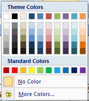
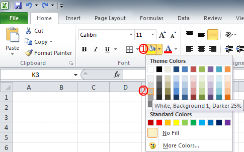
- In the Paragraph group, look for the icon that looks like a paint can. This is how you "paint" the background of a cell. Click on the arrow next to the paint can, and the following gallery shown in Figure 20 appears:
- In the gallery in the first column, hover the cursor to find the paint patch that shows White, Background 1, Darker 25% and click on it. Next, we'll change the text color. We do this by clicking on the arrow next to the capital "A" in the bottom right corner of the Font group. This brings up the gallery shown in Figure 20 again, but this time the gallery is used to select the text color rather than the background. Click on the white box in the top left corner. If you hover your cursor over this box, it will say "White, Background 1". Now type "Club Hour" in the cell. This will show white text on a gray background.
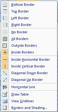
- Now we'll make our table look professional by giving it a double border around the outside. First, highlight all the cells in the table by dragging the mouse over them. In the Paragraph group, look for the icon in the bottom right corner that's next to the paint can. It looks like a square. click on the arrow next to it. This brings up the window shown in Figure 21:
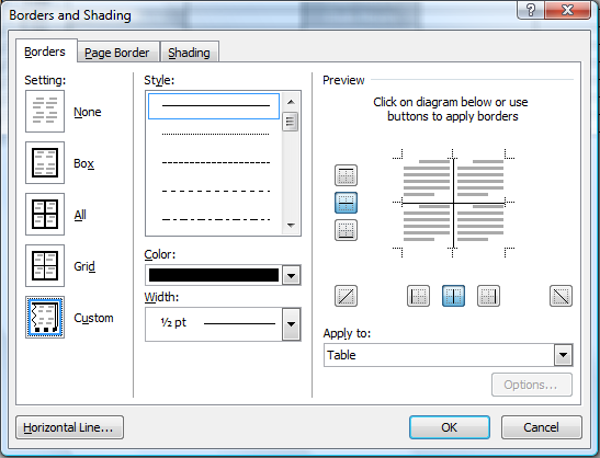
- Click on the last item in the menu: Borders and shading. This will bring up the window shown in Figure 22:
- On the left side of the window are various built-in borders. Click on the second item in the list: Box. Next, select the type of border we want by scrolling down the Style: list until we see the double lines. Click on it to select it, and click on OK.
- Now we'll repeat the process for the lines inside the table. Drag the mouse over the table cells to highlight them if they're not highlighted already. Click on the arrow next to the Borders and Shading icon you just selected for the outside. Select the last menu item again, bringing up the window in Figure 22. For the Style, scroll up to the top of the lines and select the single line. In the Preview pane on the right of the window you see an abstract version of your table, showing the double line on the outside and nothing on the inside. Click in the middle of the table and the solid lines will appear. As an alternative, you can click on the buttons surrounding the preview. Just click on the button in the middle of the left side and the button in the middle on the bottom of the preview to achieve the same effect. Click OK and the table is complete.
- Save the changes that have been made by selecting Save from inside the Microsoft Office Button.
- Finally, you will learn to use WordArt.
- Place the cursor where you want your object to appear.
- Click on the Insert to get the proper ribbon. On the right side is the WordArt icon. Click on it.
- A gallery of choices will appear. Select one that resembles our example. Click OK.
- Type "EG1003" in the box that appears. Click OK.
- If the WordArt is left adjusted, you can put it in the center of the line by clicking on the Home tab and selecting the centered justification in the Paragraph group.
- Save the document again.
- Since you have to submit this document, you need to save it again using the Word 2003 format. To do this, click on the Microsoft Office Button and select Save As... off the menu. On the window that comes up, use a file name of "lab01generic" like you did before, but this time, on the "Save as type" menu below it click on the arrow on the right, and select "Word 97-2003". Click "Save" and the document will be saved in Word 2003 format as well. Since Word 2007 has more functionality than Word 2003, especially with equations, you might get a window warning you of compatibility issues. Since we're done with this document, this is OK, so just click the "Continue" button to continue.
- Now it is time to personalize your document.
- Select Save As from the File menu. Name the file "lab01personal.doc" and save it in the "My Documents" folder on the lab computer. This will save the document in Word 2003 format as well, which is what we want.
- Personalize the generic document you just created, keeping the appropriate attributes.
- Save this new file.
Sometimes, when the Design tab opens, the equation area will be in the middle of the page. This means that Word has switched to full justification to make the quation look pretty. This is not what we want, so we'll click on the Home tab, put the paragraph back to left justification, and return to the Design tab to continue working.
Press the tab key and the cursor will jump to the tab you created on the right margin. Type "Section ??" and notice how it's filling in from the right margin. Using the methods we covered earlier, change this text to the following attributes: Courier New 48 points
For the rest of the text, we can align it using the paragraph justification buttons described earlier.
"First TA" Times New Roman 12 points, aligned right
"Second TA" Times New Roman 12 points, aligned right
"Name" Arial 24 points, underlined, centered
"email address" Courier New 16 points, bold, aligned left
"Address" Times New Roman 12 points, aligned left
Leave an empty line since most addresses take up two lines. Times New Roman 12 points, aligned left
"Phone Number" Times New Roman 12 points, aligned left
The attributes should be applied to the typed text using the icons and menus described earlier. The attributes can be selected before you type the appropriate text, or applied afterward by selecting (highlighting) the text and then applying the attributes.
Select the line spacing using the Line Spacing icon in the Paragraph group. This icon is in the middle of the bottom row of this group, next to the justification icons. It looks like arrows next to lines of text, a graphical way of indicating spacing. If you hover the cursor over the icon, it will confirm this. Just select the text you want to control line spacing for, and then click the icon. Use the following line spacing for your Word document:
To insert a comment (Microsoft Word):
- Put the cursor where you would like the comment inserted.
- Click on the Review tab. The ribbon shown in Figure 23 will appear:
- Click the New Comment icon in the Comments group. The text under the cursor will be surrounded by a red box with a connector to a box outside the document where you can type your comment. The cursor is there, so you can type your comment. Type "Argh!" and you'll see it in the comment box.
- Click anywhere in the document outside the comment area to finish. Note that in the Tracking group on the right side "Final Showing Markup" is highlighted so you can see comments. If you don't want to see the comments, click on the arrow to the right, and select the Final menu item to show the document like it was.
- We'll show the comment again by clicking on the arrow to the right of the Final word and setting the view back to "Final Showing Markup" by clicking on that menu item. The comment is now back. We can deleted the comment by putting the mouse over the comment, right clicking the mouse, and selecting Delete Comment on the menu that pops up.
Microsoft Excel
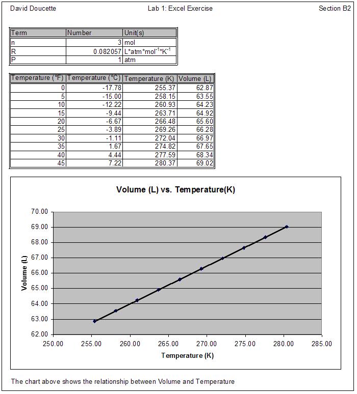
Now you will create a Microsoft Excel document. Your Excel document will include two tables and a graph showing how the volume of a gas changes when its temperature changes. Your Lab TAs will supply each student with a different value for the number of moles, n. The relationship you will graph is known as Charles' Law. When you are finished, your document will look like Figure 24.
To open Microsoft Excel, go to the Start menu, select Microsoft Office and Microsoft Office Excel 2007. Excel will start, and the home ribbon for Excel will appear, as shown in Figure 25:
Creating a Header
- In the new, blank workbook that opens, select the Page Layout tab. This will bring up the ribbon shown in Figure 26:
- In the Sheet Options group, click on the arrow in the bottom right corner of the group. This will bring up the Page Setup window. Click on the Header/Footer tab. Click on the button that says Custom Header. Three windows will appear corresponding to the left, center and right of the header you want at the top of your page. Fill in the sections as follows:
- Left section: your name.
- Center section: "Lab 1: Excel Exercise."
- Right section: your section.
- Click "OK" to save this information. Click "OK" again to remove the "Page Setup" window and return to the spreadsheet.
Note: The Header is not visible on the Excel spreadsheet as you work; it is inserted when the sheet is printed. To preview the final document, click on the Microsoft Office Button, then the Print icon, and then the Print Preview icon on the popup menu.
Setting up Your Worksheet
Note: When you enter data into Excel, it is not unusual for the data to not fit into the cell initially, making it look like the data is overrunning into the next cell. Don't worry about this - you can resize the cell later so the data fill fit.
To complete the exercise, you will create two tables. The first one is a table of constants. To create it, enter the following information into your Excel worksheet:
- In cell A1, enter Term
- In cell B1 enter Number
- In cell C1 enter Unit(s)
- In cell A2, enter n
- In cell B2, enter the value provided by your TA
- In cell C2, enter mol
- in cell A3, enter R
- In cell B3 enter 0.082057
- In cell C3, enter L*atm*mol-1*K-1
- In cell A4, enter P
- In cell B4, enter 1
- In cell C4, enter atm
Note: To make superscripts (powers), highlight what you want to make a superscript with your mouse in the area just below the ribbon. Then click on the Home tab and click on the arrow at the bottom right of the Fonts group. The Format Cells popup window will appear. Click on the Superscript box on the left side. Click the OK button and you're done. You won't see the superscript in this area, but you will see it if you look at the cell.
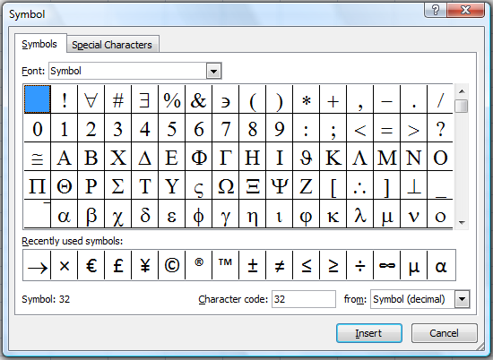
Note: In the next few cells, you'll be inserting the degree symbol. When the time comes to do this, click on the Insert tab, and click on the Symbol icon. This will bring up the Symbol pallette shown in Figure 27:
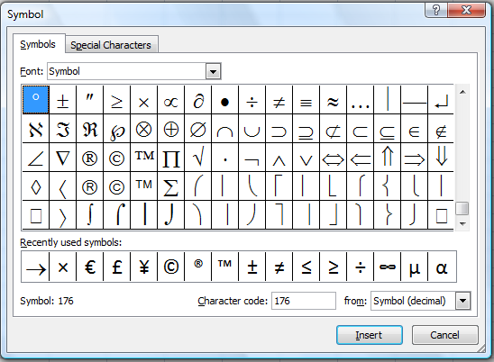
Make sure the Symbol font is being shown. If it isn't, click on the arrow to the right to show all the fonts, and select Symbol. Next, scroll down the pallette until you see the degree symbol. You do this by clicking on the scroll bar on the right side. The degree symbol is the first symbol in the ninth row. The symbol pallette with this symbol selected is shown in Figure 28:
Now, click on the Insert button and the symbol will be inserted into the text. Finally, click on the Close button to close the pallette.
Next, we'll create a table of computed values. To do this, type the following text into your Excel worksheet:
- In cell A6, enter Temperature (˚F)
- In cell B6, enter Temperature (˚C)
- In cell C6, enter Temperature (K)
- In cell D6, enter Volume (L)
Enter Fahrenheit temperatures 0 – 45 ˚F into cells A7 through A16, increasing the temperature by 5 ˚F in each successive cell.
Using Formulas
Formulas perform calculations in your worksheet. The calculations may use values in other cells, making Excel a very powerful calculator program. A formula is entered in the destination cell where you want the answer to appear. Excel has many built in functions that you can use. The destination cell value is the implied result and so a formula always starts with an equal sign (=).
As an example of the syntax, the formula "= 5*(P98) +ABS(X15)/0.34" would take the value in cell P98 and multiply it by five, and then add the result to the absolute value of the contents of cell X15 divided by 0.34. If you are in doubt about the order of the mathematical operations, use parentheses to make sure the result is calculated correctly. The full range of functions can be selected clicking on the Formulas tab. This brings up the ribbon shown in Figure 29:
There are several ways to choose the formula you want and you don't know its name. The first way is to click on the Insert function icon at the left end of the ribbon. At the top of the dialog box that pops up, there's a place where you can type the description of what you're looking for and Excel will show matches. If you have a pretty good idea of what type of function you want, you can use the colored book icons along the top of the ribbon. Just click on the icon for the category you want and then choose the function from the list.
You will use the following expression to convert your simulated data into degrees Celsius:
- Enter "=5/9*(A7-32)" into cell B7.
- Now we'll copy the formula into other cells. To do this, click on the cell. Click on the Home tab on the ribbon. Click on the Copy icon at the left end of the ribbon. highlight cells B8 through B16 by dragging the mouse over them. Click on the Paste icon that looks like a clipboard at the left end of the ribbon.
- Click on the cells between B7 and B16 one at a time and examine the contents. Notice that the cell reference in the formula has automatically been adjusted in each destination cell.
You will then use the following expression to convert your data into Kelvin:
- Enter "=B7+273.15" into cell C7.
- Copy this formula into the cells C8 through C16 using the same method we used earlier.
- Click on the cell C16 and look at the contents. Notice that the cell reference in the formula (B7) has automatically been adjusted to B16.
You will use the ideal gas law expression to compute the volume for your exercise:
- Enter "=($B$2*$B$3*C7)/$B$4" into cell D7.
- Copy this formula into the cells D8 through D16 using the same method we used earlier.
- Click on cell D16 and notice that all the cell references except C7 have been kept constant. Typing a $ before a cell reference letter or number fixes the value, even if is it later copied. Two $ keeps both the cell letter and the cell number constant.
Formatting Your Tables
First, you need to be able to see the entire contents of each column. By default, Excel sets all columns to the same width, and fields containing long strings of data can be obstructed by other columns. However, Excel can resize each column to make all the data it contains visible. Always review your data and decide if the number of digits displayed in the worksheet is appropriate. Start by making sure no cells are highlighted. If there are, just click on any cell so that just the usual outline box is present.
- Move the cursor up to the top of the spreadsheet and hover the cursor between the A and B column headers. Note that the cursor changes to a vertical line with an arrow on each side, as shown in Figure 30:
- Double click on the boundary between the column headers and the width of the column to the left will automatically resize. Do this for the other columns as well.
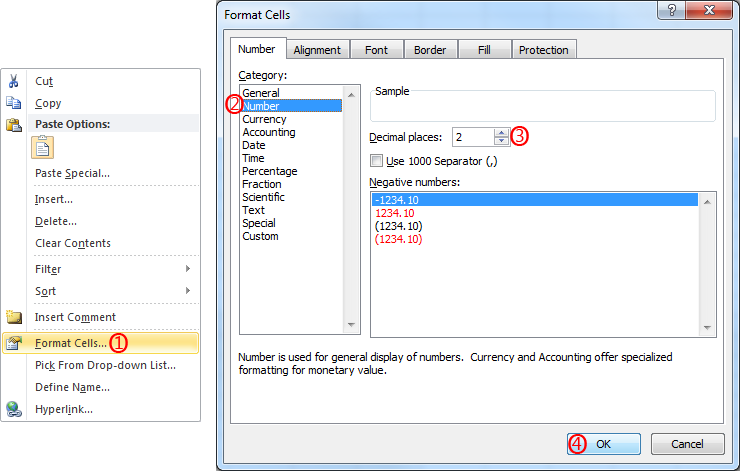
- In our example two digits after the decimal point is appropriate. Adjust the display by highlighting the data cells B7:D16 (drag the mouse). Click on the arrow in the bottom right corner of the Font group in the Home tab to bring up the Format Cells dialog box shown in Figure 31:
- Click on the Number tab in the dialog box. In the Category list, click on the Number item and the window will change to allow you to format numbers. Note that the number of decimal places is 2, which is what you want. Click on the OK button and you're done.
- Changing the number of places in the "Volume" column now made the column too wide, since it no longer has to hold so many places. Make sure no cells are highlighted and resize the column by double clicking the right edge of the column again.
Creating Table Borders
As part of this section, you'll see a different way to work with cells.
- In your Excel worksheet, highlight the table of constants (cells A1-C4), and right click within the highlighted area.
- From the dialog box that appears, select Format Cells. This will bring up the same Format Cells dialog box that you saw before.
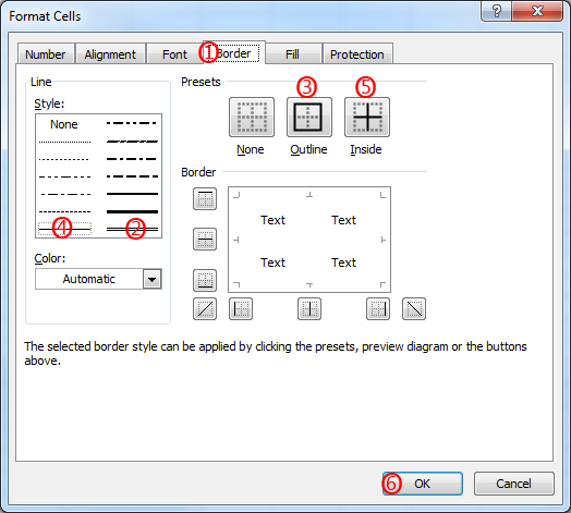
- In the Format Cells dialog box, go to the Border tab. This will change the dialog box to what's shown in Figure 32:
- Make the constant table professional looking by selecting the double lines in the bottom right corner of the "Style", and the "Outline" preset. Now we'll put grid lines inside by selecting the single line in the bottom left corner of "Style", and the "Inside" preset. The preview picture will now show a grid with a double line frame and single line inside lines. Click "OK", and you'll now see the table of constants being nicely framed.
- Next, we'd like to separate the column headers from the numbers. Highlight the column header cells (A1-C1), and right click within the highligted area. Like before, select Format Cells from the context menu that appears and go to the Border tab. Select the double lines in the bottom right corner of "Style" and the "Outline" present. Next, we'd like to shade the column headers so they stand out more. Click on the "Fill" tab and the dialog box will change to Figure 33:
- Select the gray box in the middle row on the left side, which will be 25% darker. Click "OK", and you'll see that the column headers now have their own frame and shading.
- Repeat steps 1-6 for the table of computations.
Creating a Chart
As the final step in this exercise, you will be graphing the relationship between volume and temperature, using the Chart feature in Excel. To create a chart:
- Select the temperature and volume values in cells C7–D16.
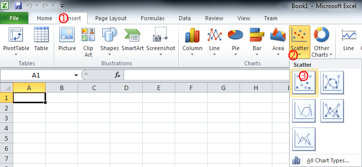
- Click on the Insert tab on the ribbon. The ribbon will change to what's shown in Figure 34:
- The Chart group is in the middle of the ribbon. Click on the Scatter icon. This will bring up the pallette shown in Figure 35:
- On the pallette, click on the first icon: Scatter with only markers.
- The chart appears on your spreadsheet, and the ribbon changes to the Design tab so you can customize your chart, as shown in Figure 36:
- The chart points are probably blue, which don't print well on a black and white printer. If you look at the ribbon, the chart style is probably "Style 2". Click on "Style 1" and you'll get black points, which will print better.
- Now we'll customize the chart by adding the axis labels and title. In the Chart Layouts group, hover the cursor over the first icon, and the caption "Layout 1" will appear. This is the layout we want, so click on the icon.
- Click on the vertical axis title. Highlight the existing text that says "Axis Title" and change it to "Volume (L)".
- Click on the horizontal axis title. Highlight the existing text that says "Axis Title"and change it to "Temperature (K)".
- Click on the title. Highlight the existing text that says "Chart Title" and change it to "Volume (L) vs. Temperature (K)".
- Click on the Series 1 text on the right side, which is the chart legend. We don't need a legend for this chart. Put the cursor over the data point in front of the words and the cursor will change to a crosshair with arrows. Press the Delete key and the legend will disappear. The chart will also automatically resize to fill the space.
- Select any data point on your chart. Excel will automatically select all remaining points for you.
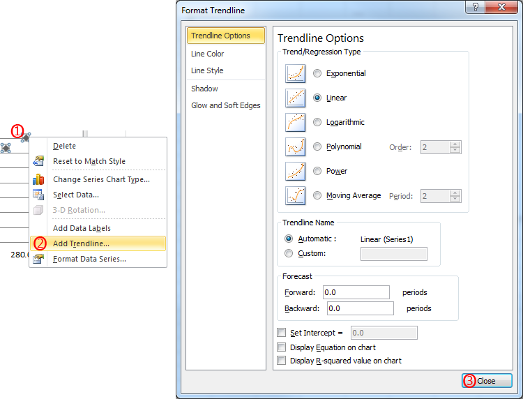
- Right-click within the chart. From the context menu that appears, select Add Trendline.... This will bring up the dialog box shown in Figure 37:
- As you can see, there are a lot of options. Fortunately, the defaults are exactly what we want, so just click the Close button. The chart now has the trendline we want.
- Reposition the chart within your worksheet so that it does not obstruct your data tables. Do this by clicking anywhere on the chart. Squares will appear around the border of the chart indicating that it has been selected. Click the mouse, and "drag" the chart to where you want it, which is typically on the left edge of the spreadsheet, with one row between the bottom of the data table and the top of the chart.
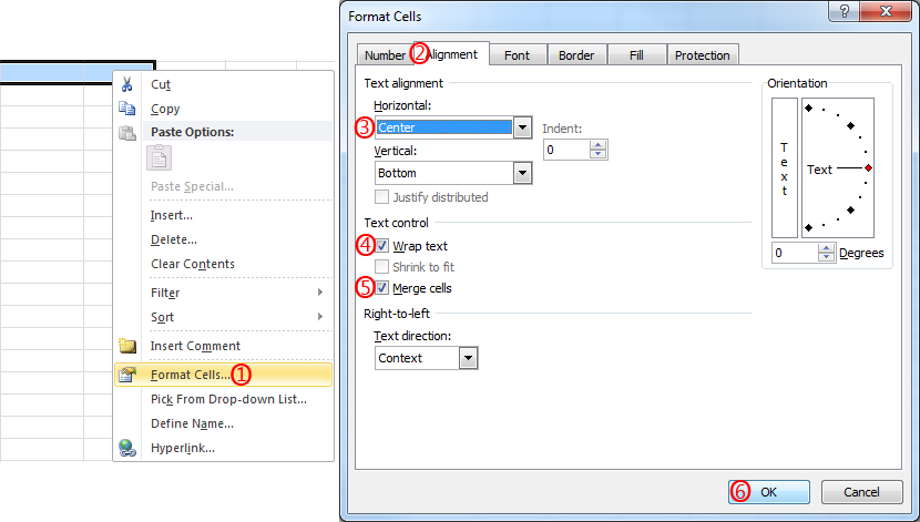
- Select a set of cells beneath your graph roughly the same width as the graph, starting where you want the caption to begin, and right click within the selected group of cells. From the context menu that appears, select Format Cells. The Format Cells dialog box that you saw earlier appears. Click on the Alignment tab , and the dialog box changes to Figure 38:
- In the Text alignment area, for Horizontal, click on the arrow to the right of the word "General" and a dropdown menu appears. Click on Center.
- In the Text control area, check the Wrap Text and Merge Cells checkboxes, and click OK.
- In the highlighted cells, enter a suitable caption for your chart.
- Since we're done with the worksheet, we'll save it in Office 2003 format for submission. Click on the Microsoft Office button. Click the "Save As" icon. Change the "Save as Type" to "Excel 97-2003 Workbook", and use a File Name of "lab01excel.xls". Print a copy of the sheet as well by clicking again on the Microsoft Office button, clicking the Print icon, and clicking the OK button on the Print dialog box that comes up.
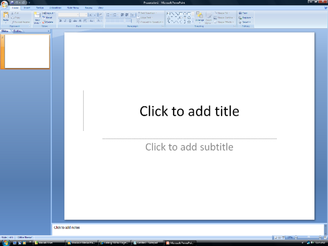
- To open Microsoft PowerPoint, go to the Start menu, select Microsoft Office and Microsoft Office PowerPoint 2007. PowerPoint will start. A new slide will appear with the default Title layout (see Figure 40). Click where it says, "Click to add title" and enter the title of your presentation.
- From the Slide group, click on the New Slide icon. This will advance your presentation to the next slide, which will be blank. When you select this, PowerPoint will display a number of alternatives for you to choose from on how to layout your next slide. Choose the one you like best.
- Click anywhere inside the box marked "Click to Add Text" and insert your information. Continue this process until you have outlined your entire presentation.
- To add an object from another software application, like Word or Excel, simply copy and paste your object onto the selected PowerPoint slide.
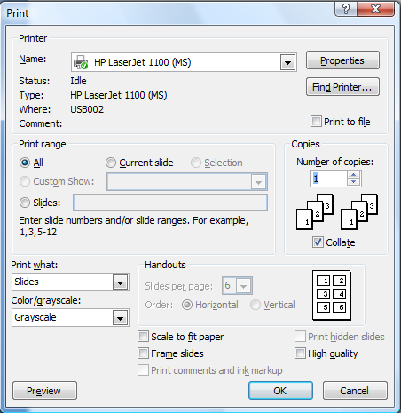
- Click on the Microsoft Office button. From the menu that appears, click on the Print icon. The box in Figure 42 will appear.
- In the box marked Print what: select Handouts.
- In the box marked Color/grayscale select Pure Black and White.
- In the box marked Slides per page choose six, using Horizontal order.
- Click OK to print.
Adding a Trendline
A trendline is a fit to data, indicating the general behavioral tendency or trend of the data, if any. This allows you to more easily see the nature of any relationship between the quantities in your graph. To add a trendline to your chart:
Adding a Caption to Your Chart
Microsoft PowerPoint
Now you will create a PowerPoint presentation reporting on the work done in Lab 1. PowerPoint has five viewing windows. Slide View displays one slide at a time, Outline View lists the text for each slide in your presentation, Slide Shorter View displays thumbnails of all your slides allowing you to reorder them easily, and Notes Page View lets you attach text to each slide. Finally, you can view your slides in order in the Slide Show View.
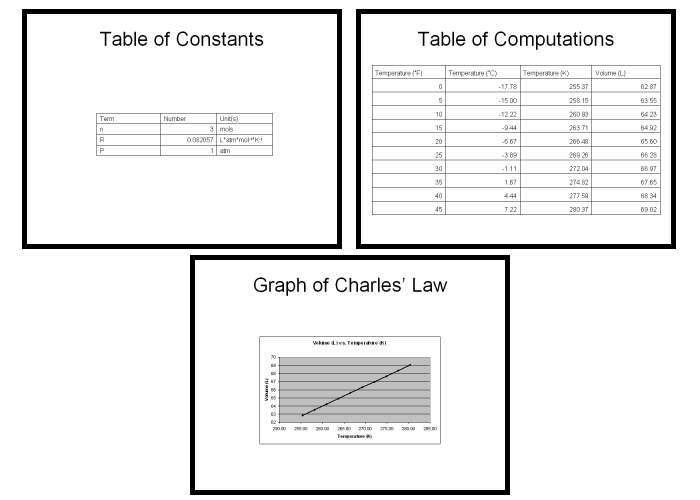
For this lab, your presentation must include a title slide, a brief overview of the presentation, examples of the work done in this lab (either screenshots, or material copied and pasted from the original documents) and a conclusion slide. You may use any design template that you like. Use a title slide at the beginning of your presentation and the bulleted slides for the information that follows. Figure 39 contains some examples of what your slides might look like.
Microsoft PowerPoint allows you to customize the design of your presentation.
To select a design template before you begin, click on the Design tab on the ribbon. The Themes group will show the slide themes you currently have available. Initially, it is a rather limited selection. However, there are hundreds of themes available. Sample slides of each theme are shown in the group. To have a wider selection, click on the downward facing arrow just to the right of the sample slides, to the left of the icons for Colors, Fonts, and Effects. This will bring up the dialog box shown in Figure 41:
In addition to seeing the themes you already have, there is also a selection of how to acquire more. Click on the message "More Themes on Microsoft Office Online..." and you'll be directed to the Microsoft Web site that is an archive of many templates for all the Office products. In the top left corner of the Web page you'll see a group called Search. Just below the word "Templates" there's a line where you can enter text saying what you want to search for. For example, if you want to use a theme with a space orientation, type in "slides space" and click on the Search icon. This will bring up the first 100 themes related to space, 14 at a time. You should be able to find a theme you like on almost any subject.
Note: The Design tab also allows you to adjust your color schemes too. Click on the Colors icon on the right side of the Themes group. From the dialog box that appears you can select a predefined color scheme, or design one of your own. Remember to choose a scheme that has a high contrast between the letters on the slide and the background so that your audience can read the slides easily. The built-in schemes are designed to do this.
IMPORTANT
Make sure you run Spell Check when you have completed your presentation! To run it, hit F7. After making any corrections, save your presentation as "lab01PowerPoint.ppt." Remember to save it as an Office 97-2003 presentation so it can be submitted electronically.
You can print a copy of your presentation just like Word and Excel. To print a copy of your PowerPoint Presentation:
Your lab work is now complete. Email copies of all the files you created to your personal account. Review the files for errors before submitting your report.
Please clean up your workstation before you leave the lab. Refer to section 3 Your Assignment for the list of the specific items you must submit for your report.
| ||||||||
