Microsoft Office Skill Builder
From EG1004 Lab Manual
Revision as of 15:52, 6 September 2010 by Admin (talk | contribs) (→Microsoft Excel: Andrew Zhen 2010-07-19)
Microsoft Excel
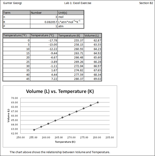
Now you will create a Microsoft Excel document. Your Excel document will include two tables and a graph showing how the volume of a gas changes when its temperature changes. Your Lab TAs will supply each student with a different value for the number of moles, n. The relationship you will graph is known as Charles' Law. When you are finished, your document will look like Figure 24.
- To open Microsoft Excel, go to the Start menu, select Microsoft Office and Microsoft Office Excel 2007. Excel will start, and the home ribbon for Excel will appear, as shown in Figure 25:
- Creating a Header
- In the new, blank workbook that opens, select the Page Layout tab. This will bring up the ribbon shown in Figure 26:
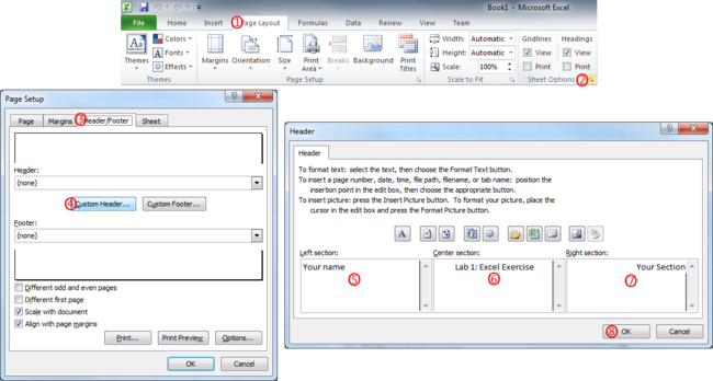
- In the Sheet Options group, click on the arrow in the bottom right corner of the group. This will bring up the Page Setup window. Click on the Header/Footer tab. Click on the button that says Custom Header. Three windows will appear corresponding to the left, center and right of the header you want at the top of your page. Fill in the sections as follows:
- Left section: your name.
- Center section: "Lab 1: Excel Exercise."
- Right section: your section.
- Click "OK" to save this information. Click "OK" again to remove the "Page Setup" window and return to the spreadsheet.
- Note: The Header is not visible on the Excel spreadsheet as you work; it is inserted when the sheet is printed. To preview the final document, click on the Microsoft Office Button, then the Print icon, and then the Print Preview icon on the popup menu.
- Setting up Your Worksheet
- Note: When you enter data into Excel, it is not unusual for the data to not fit into the cell initially, making it look like the data is overrunning into the next cell. Don't worry about this - you can resize the cell later so the data fill fit.
- To complete the exercise, you will create two tables. The first one is a table of constants. To create it, enter the following information into your Excel worksheet:
- In cell A1, enter Term
- In cell B1 enter Number
- In cell C1 enter Unit(s)
- In cell A2, enter n
- In cell B2, enter the value provided by your TA
- In cell C2, enter mol
- in cell A3, enter R
- In cell B3 enter 0.082057
- In cell C3, enter L*atm*mol-1*K-1
- Note: To make superscripts (powers), highlight what you want to make a superscript with your mouse in the area just below the ribbon. Then click on the Home tab and click on the arrow at the bottom right of the Fonts group. The Format Cells popup window will appear. Click on the Superscript box on the left side. Click the OK button and you're done. You won't see the superscript in this area, but you will see it if you look at the cell.
- In cell A4, enter P
- In cell B4, enter 1
- In cell C4, enter atm
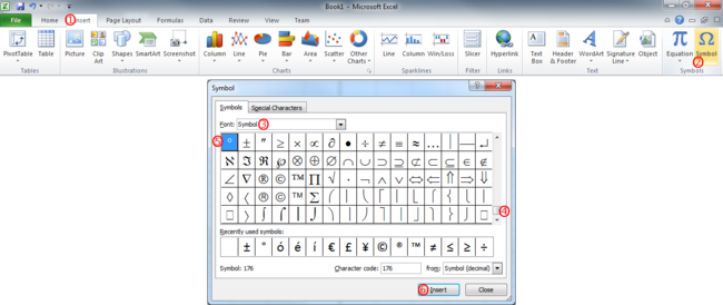
- Note: In the next few cells, you'll be inserting the degree symbol. When the time comes to do this, click on the Insert tab, and click on the Symbol icon. This will bring up the Symbol palette shown in Figure 27:
- Make sure the Symbol font is being shown. If it isn't, click on the arrow to the right to show all the fonts, and select Symbol. Next, scroll down the pallette until you see the degree symbol. You do this by clicking on the scroll bar on the right side. The degree symbol is the first symbol in the ninth row. The symbol pallette with this symbol selected is shown in Figure 28:
- Now, click on the Insert button and the symbol will be inserted into the text. Finally, click on the Close button to close the palette.
- Next, we'll create a table of computed values. To do this, type the following text into your Excel worksheet:
- In cell A6, enter Temperature (°F)
- In cell B6, enter Temperature (°C)
- In cell C6, enter Temperature (K)
- In cell D6, enter Volume (L)
- Enter Fahrenheit temperatures 0 – 45 °F into cells A7 through A16, increasing the temperature by 5 °F in each successive cell.
- Using Formulas
- Formulas perform calculations in your worksheet. The calculations may use values in other cells, making Excel a very powerful calculator program. A formula is entered in the destination cell where you want the answer to appear. Excel has many built in functions that you can use. The destination cell value is the implied result and so a formula always starts with an equal sign (=).
- As an example of the syntax, the formula "= 5*(P98)+ABS(X15)/0.34" would take the value in cell P98 and multiply it by five, and then add the result to the absolute value of the contents of cell X15 divided by 0.34. If you are in doubt about the order of the mathematical operations, use parentheses to make sure the result is calculated correctly. The full range of functions can be selected clicking on the Formulas tab. This brings up the ribbon shown in Figure 29:
- There are several ways to choose the formula you want and you don't know its name. The first way is to click on the Insert function icon at the left end of the ribbon. At the top of the dialog box that pops up, there's a place where you can type the description of what you're looking for and Excel will show matches. If you have a pretty good idea of what type of function you want, you can use the colored book icons along the top of the ribbon. Just click on the icon for the category you want and then choose the function from the list.
- You will use the following expression to convert your simulated data into degrees Celsius:
- Failed to parse (MathML with SVG or PNG fallback (recommended for modern browsers and accessibility tools): Invalid response ("Math extension cannot connect to Restbase.") from server "https://wikimedia.org/api/rest_v1/":): {\displaystyle ^\circ C = \frac{5}{9} \left( ^\circ F - 32 \right)\,}
- Enter "=5/9*(A7-32)" into cell B7.
- Now we'll copy the formula into other cells. To do this, click on the cell. Click on the Home tab on the ribbon. Click on the Copy icon at the left end of the ribbon. highlight cells B8 through B16 by dragging the mouse over them. Click on the Paste icon that looks like a clipboard at the left end of the ribbon.
- Click on the cells between B7 and B16 one at a time and examine the contents. Notice that the cell reference in the formula has automatically been adjusted in each destination cell.
- You will then use the following expression to convert your data into Kelvin:
- Failed to parse (MathML with SVG or PNG fallback (recommended for modern browsers and accessibility tools): Invalid response ("Math extension cannot connect to Restbase.") from server "https://wikimedia.org/api/rest_v1/":): {\displaystyle K = ^\circ C + 273.15\,}
- Enter "=B7+273.15" into cell C7.
- Copy this formula into the cells C8 through C16 using the same method we used earlier.
- Click on the cell C16 and look at the contents. Notice that the cell reference in the formula (B7) has automatically been adjusted to B16.
- You will use the ideal gas law expression to compute the volume for your exercise:
- Enter "=($B$2*$B$3*C7)/$B$4" into cell D7.
- Copy this formula into the cells D8 through D16 using the same method we used earlier.
- Click on cell D16 and notice that all the cell references except C7 have been kept constant. Typing a $ before a cell reference letter or number fixes the value, even if is it later copied. Two $ keeps both the cell letter and the cell number constant.
- Formatting Your Tables
- First, you need to be able to see the entire contents of each column. By default, Excel sets all columns to the same width, and fields containing long strings of data can be obstructed by other columns. However, Excel can resize each column to make all the data it contains visible. Always review your data and decide if the number of digits displayed in the worksheet is appropriate. Start by making sure no cells are highlighted. If there are, just click on any cell so that just the usual outline box is present.
- Move the cursor up to the top of the spreadsheet and hover the cursor between the A and B column headers. Note that the cursor changes to a vertical line with an arrow on each side, as shown in Figure 30:
- Double click on the boundary between the column headers and the width of the column to the left will automatically resize. Do this for the other columns as well.
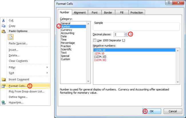
- In our example two digits after the decimal point is appropriate. Adjust the display by highlighting the data cells B7:D16 (drag the mouse). Click on the arrow in the bottom right corner of the Font group in the Home tab to bring up the Format Cells dialog box shown in Figure 31:
- Click on the Number tab in the dialog box. In the Category list, click on the Number item and the window will change to allow you to format numbers. Note that the number of decimal places is 2, which is what you want. Click on the OK button and you're done.
- Changing the number of places in the "Volume" column now made the column too wide, since it no longer has to hold so many places. Make sure no cells are highlighted and resize the column by double clicking the right edge of the column again.
- Creating Table Borders
- As part of this section, you'll see a different way to work with cells.
- In your Excel worksheet, highlight the table of constants (cells A1-C4), and right click within the highlighted area.
- From the dialog box that appears, select Format Cells. This will bring up the same Format Cells dialog box that you saw before.
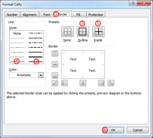
- In the Format Cells dialog box, go to the Border tab. This will change the dialog box to what's shown in Figure 32:
- Make the constant table professional looking by selecting the double lines in the bottom right corner of the "Style", and the "Outline" preset. Now we'll put grid lines inside by selecting the single line in the bottom left corner of "Style", and the "Inside" preset. The preview picture will now show a grid with a double line frame and single line inside lines. Click "OK", and you'll now see the table of constants being nicely framed.
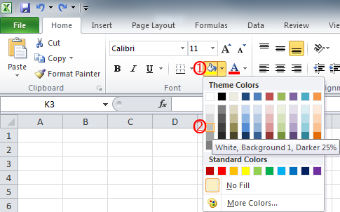
- Next, we'd like to separate the column headers from the numbers. Highlight the column header cells (A1-C1), and right click within the highligted area. Like before, select Format Cells from the context menu that appears and go to the Border tab. Select the double lines in the bottom right corner of "Style" and the "Outline" present. Next, we'd like to shade the column headers so they stand out more. Click on the "Fill" tab and the dialog box will change to Figure 33:
- Select the gray box in the middle row on the left side, which will be 25% darker. Click "OK", and you'll see that the column headers now have their own frame and shading.
- Repeat steps 1-6 for the table of computations.
- Creating a Chart
- As the final step in this exercise, you will be graphing the relationship between volume and temperature, using the Chart feature in Excel. To create a chart:
- Select the temperature and volume values in cells C7–D16.
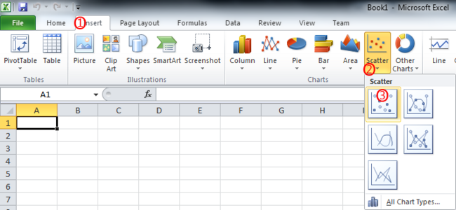
- Click on the Insert tab on the ribbon. The ribbon will change to what's shown in Figure 34:
- The Chart group is in the middle of the ribbon. Click on the Scatter icon. This will bring up the pallette shown in Figure 35:
- On the pallette, click on the first icon: Scatter with only markers.
- The chart appears on your spreadsheet, and the ribbon changes to the Design tab so you can customize your chart, as shown in Figure 36:
- The chart points are probably blue, which don't print well on a black and white printer. If you look at the ribbon, the chart style is probably "Style 2". Click on "Style 1" and you'll get black points, which will print better.
- Now we'll customize the chart by adding the axis labels and title. In the Chart Layouts group, hover the cursor over the first icon, and the caption "Layout 1" will appear. This is the layout we want, so click on the icon.
- Click on the vertical axis title. Highlight the existing text that says "Axis Title" and change it to "Volume (L)".
- Click on the horizontal axis title. Highlight the existing text that says "Axis Title"and change it to "Temperature (K)".
- Click on the title. Highlight the existing text that says "Chart Title" and change it to "Volume (L) vs. Temperature (K)".
- Click on the Series 1 text on the right side, which is the chart legend. We don't need a legend for this chart. Put the cursor over the data point in front of the words and the cursor will change to a crosshair with arrows. Press the Delete key and the legend will disappear. The chart will also automatically resize to fill the space.
- Adding a Trendline
- A trendline is a fit to data, indicating the general behavioral tendency or trend of the data, if any. This allows you to more easily see the nature of any relationship between the quantities in your graph. To add a trendline to your chart:
- Select any data point on your chart. Excel will automatically select all remaining points for you.
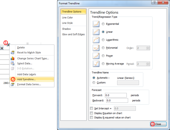
- Right-click within the chart. From the context menu that appears, select Add Trendline.... This will bring up the dialog box shown in Figure 37:
- As you can see, there are a lot of options. Fortunately, the defaults are exactly what we want, so just click the Close button. The chart now has the trendline we want.
- Adding a Caption to Your Chart
- Reposition the chart within your worksheet so that it does not obstruct your data tables. Do this by clicking anywhere on the chart. Squares will appear around the border of the chart indicating that it has been selected. Click the mouse, and "drag" the chart to where you want it, which is typically on the left edge of the spreadsheet, with one row between the bottom of the data table and the top of the chart.
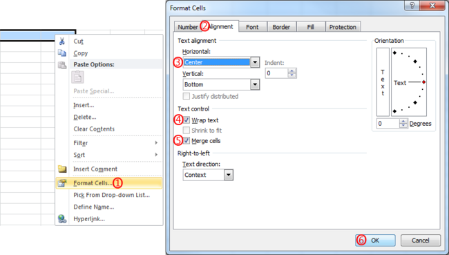
- Select a set of cells beneath your graph roughly the same width as the graph, starting where you want the caption to begin, and right click within the selected group of cells. From the context menu that appears, select Format Cells. The Format Cells dialog box that you saw earlier appears. Click on the Alignment tab , and the dialog box changes to Figure 38:
- In the Text alignment area, for Horizontal, click on the arrow to the right of the word "General" and a dropdown menu appears. Click on Center.
- In the Text control area, check the Wrap Text and Merge Cells checkboxes, and click OK.
- In the highlighted cells, enter a suitable caption for your chart.
- Since we're done with the worksheet, we'll save it for submission.
